“You know it's time to sell when shoeshine boys give […]
The most powerful Bitcoin chart you’ll ever see
February 16, 2023
The most compelling Bitcoin chart you’ll ever see:
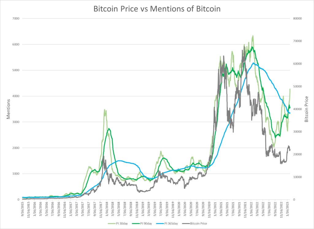
Dark Grey line: Price of Bitcoin
Blue line: 1-year moving average of “buying Bitcoin” mentions on social media
Green and Light Green lines: 90 and 30-day moving averages of “buying Bitcoin” mentions on social media.
Note what happens to the price of Bitcoin each time the green lines cross the blue line (in either direction).
And now, for the first time since May of 2020, just before Bitcoin's meteoric rise from $10k to $60k+, both green lines are screaming higher and have crossed the one-year moving average to the upside.
Could this be the start of the next 3x, 4x, 5x, or maybe even a larger move?
Want deeper insights? Get Free Access to The Vault.
Tags: